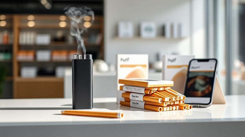
Inside a Modern HNB Storefront: Navigation, Product Pages and Checkout
A good heat-not-burn shop should feel calm and legible. That sounds like a small design goal, but it shapes everything: how quickly you find the right sticks, whether a product page answers your questions without noise, and how confident you feel when you reach checkout. Puff EU, an online retailer of heat-not-burn devices and sticks, has built its storefront around that idea of clarity. Walking through it as a design-aware consumer reveals a structure that prioritises orientation over decoration — and that matters when the product you are looking for is as specific as RIVO sticks for glo Hilo.
This is a UX walkthrough, not a product review. The goal is to notice how the shop organises itself: the homepage logic, the way category and product pages are laid out, how the cart and checkout behave, and what the mobile experience feels like. Along the way, the structure shows why a storefront that stays quiet and legible can serve adult smokers and existing HNB users better than one that shouts.
Homepage logic: orientation before promotion
The first screen of an HNB storefront has a difficult job. It needs to signal what the shop sells, who it is for, and where to go next — without turning into a wall of banners. On Puff EU, the homepage reads as an index rather than a billboard. The brand and category structure is visible early, and the navigation does not hide the fact that the store is organised around heat-not-burn devices and consumable sticks.
That decision has a real effect on browsing. A visitor who already knows the device they own can move toward compatible sticks quickly, while someone newer to heated tobacco can start with devices and work outward. The homepage does not try to force a single journey. Instead, it offers a few clear entry points and lets the visitor choose. For a niche product category, that is the right instinct: orientation first, promotion second.
The visual language supports this. Clean surfaces, product-focused imagery and restrained typography keep attention on the items themselves. There is no attempt to mimic combustible cigarette advertising, and no smoke-and-clouds imagery that would blur the category. The shop presents itself as what it is — a European e-commerce retailer of heat-not-burn products — and the design follows that positioning.
Category pages: finding the right stick without friction
Category pages are where most HNB shoppers actually spend their time, and they are a good test of storefront design. The RIVO sticks category is a useful example. The page is structured around the product range itself, with item names, pack details and pricing presented in a consistent grid. Nothing about the layout requires you to decode it; the information you need to compare sticks sits in the same place for each item.
What works here is the restraint. A less careful shop might crowd category pages with cross-sells, urgency badges and pop-ups. Puff EU keeps the grid readable and lets filtering and sorting do the organisational work. For a shopper who already knows they want RIVO sticks for a glo Hilo device, that means fewer distractions between arrival and decision.
The category structure also reflects how HNB users actually think. They tend to start from the device they own and then look for compatible consumables, rather than browsing every stick on the market. A storefront that mirrors that mental model — device family first, stick variant second — reduces the chance of a mismatch and makes the range feel smaller and more manageable than it really is.
Product pages: information density without clutter
A product page has to answer a short list of questions: what is this, which device does it work with, how many packs are in the order, and what does it cost. The best HNB product pages answer those questions in the first screen and leave the rest for further reading. On Puff EU, product pages follow that pattern. The product name, compatibility information and price are presented together, with supporting details below rather than competing for attention above the fold.
This matters more than it might seem. Heat-not-burn sticks are not interchangeable in the way a casual shopper might assume; device compatibility is the central fact. A product page that buries compatibility in a long description creates doubt, and doubt slows down checkout. By keeping that information visible and consistent, the storefront treats the shopper as someone who knows what they need and simply wants confirmation.
The imagery is similarly functional. Products are shown cleanly, without staged smoke effects or lifestyle scenes that would misrepresent the category. The result is a page that feels like a well-organised shelf rather than a sales pitch — which, for a repeat HNB buyer, is exactly the right tone.
Cart and checkout: reducing hesitation at the final step
The cart is where good storefronts either earn trust or lose it. On Puff EU, the cart summarises the selected items, quantities and totals in a straightforward layout, with the next step clearly marked. There is no attempt to upsell aggressively at this stage, and no surprise additions to the order. For a consumable product bought repeatedly, that predictability is valuable.
Checkout continues the same logic. The store advertises secure payment options, and the flow reflects that priority: payment methods are presented clearly, the order summary remains visible, and the steps are ordered in the sequence a shopper expects. Delivery information for European destinations is part of the same flow rather than a separate scavenger hunt. The design goal is not to make checkout exciting; it is to make it uneventful.
That is harder than it sounds. Checkout is where anxiety peaks, especially for age-restricted products ordered online. A calm layout, consistent labelling and a visible order summary do more for conversion than any persuasive copy. The storefront’s restraint here reads as confidence: the shop expects you to know what you want and simply helps you complete the order.
Mobile experience: the same clarity on a smaller screen
Most HNB shopping happens on a phone, often in short sessions. A storefront that works on desktop but collapses on mobile is effectively half a shop. Puff EU’s mobile layout keeps the same hierarchy as the desktop version: navigation remains reachable, category grids reflow into a single readable column, and product pages keep compatibility and price near the top.
The mobile cart and checkout are where this discipline shows most clearly. Form fields are sized for touch, the order summary stays accessible, and the payment step does not require pinch-zooming or hunting for buttons. The experience is not flashy, but it is consistent — and consistency is what makes a storefront feel trustworthy on a small screen.
There is a broader point here about HNB e-commerce in Europe. Shoppers often compare prices and ranges across several shops in quick succession, frequently on mobile. A storefront that loads cleanly, labels products consistently and keeps the path to checkout short will be the one that gets the order. Design, in this category, is mostly a matter of removing friction.
A short usability note on calm storefronts
What stands out after walking through Puff EU is how little the storefront asks of the visitor. The homepage orients, the category pages organise, the product pages confirm, and the checkout completes. Each step does one job and does it without noise. For a niche as specific as heat-not-burn, that calm structure is not a stylistic preference — it is a usability requirement.
Adult smokers and existing HNB users tend to arrive with a clear intent: a device, a stick family, a repeat order. The storefront that respects that intent, rather than interrupting it, is the one that feels modern. Puff EU’s design reads as a deliberate choice to stay legible: clean product presentation, consistent category logic, secure and predictable checkout, and a mobile experience that mirrors the desktop rather than fighting it. In a market full of loud pages, a quiet, well-organised shop is the more useful one.